
Track View #
The track view is the dashboard that shows you the current security status of your organization. As you can view the vulnerability details of your organization in one place, this will be the main point of interest for anyone dealing with compliance KPIs in your organization.

The track view presents data from your datasources in the Input view. It not only shows you the information with your most up-to-date scans, but you can also view a history of past snapshots and also a projection as to how your future would look like. You are able to also filter by dataset, meaning you can select all of your current datasets or a specific one only. The track view is divided into certain sections to help you monitor and manage your KPIs. Each category has an information icon next to its name, so you can hover over it to view detailed information for each category.
If you have questions on the data or something seems incorrect, please reach out to us with the Help button on the top right corner, or email us at ask@patchfox.io.
Here are some more detailed explanations of each section in the top row. The top row focuses on a summary of your vulnerabilities (CVEs) and the performance trends:

CVEs Avoided:
This section shows you the total number of CVEs avoided for your organization. It also shows you the trend and performance of this category compared to the past 90 days, and in the bottom left corner, it also shows you a prediction of the future trend.
In the example on the left, it shows that 1241 CVEs were avoided, with a 3% increase compared to the past 90 days, and forecasts a predicted decrease of 2% for the future.
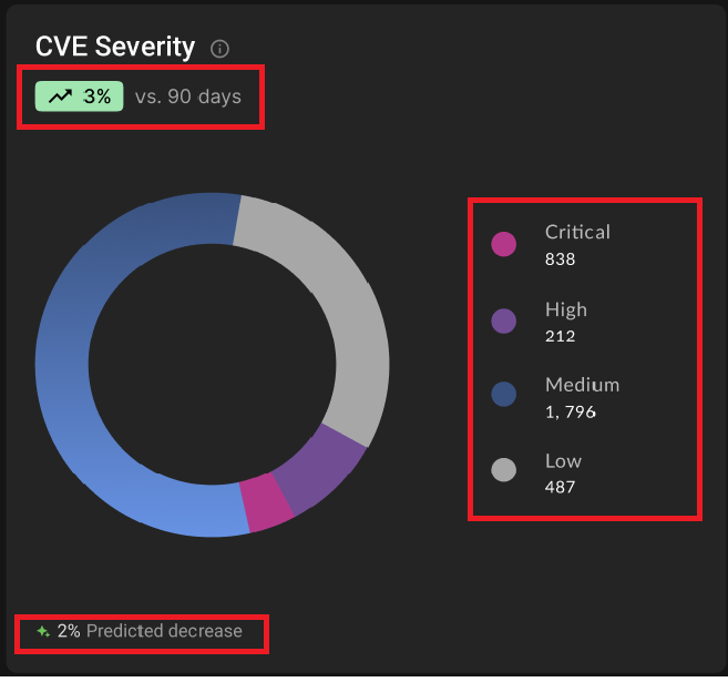
CVE Severity:
This section shows you a summary of the severities of the current vulnerabilities in your organization. It is divided into 4 different levels (critical, high, medium, low), and helps an organization to plan out their remediation timelines accordingly.
As with the CVEs Avoided category, this view also displays the performance trend compared to 90 days and a predictability for the future.

CVE Backlog
This section shows you the trend for your vulnerability backlog. You can view the number of vulnerabilities in your backlog over 1 to 3 months (how long the vulnerability has been there for), and by viewing this backlog health chart, it will help you determine problem points and to plan for the future.
You can view each type of severity (critical, high, medium, low) from the color-coded chart, and as with the above two categories, you can also view the performance trend compared to 90 days.
Here are some more detailed explanations of each section in the bottom row. The bottom row focuses on package information and health:

Stale Packages:
This section shows you a summary of your stale packages, which are packages that are no longer supported or maintained, and therefore can pose security risks in the future. They are separated by duration (time since they become “outdated”).
In the left example, you can view the red alert icon on the top, signaling that it needs attention. For beta, this section is only available for Java packages, but we will soon be adding support for other languages.
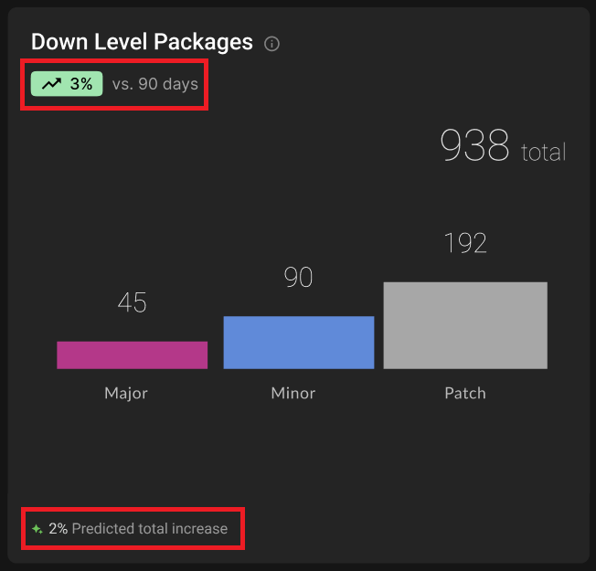
Down Level Packages:
This section shows you a summary of packages that are using a version that is behind the most recent version, so that they catch your eye before they become a problem.
The packages are divided into three major categories (major, minor, patch) to show the versioning scheme. For beta, this section is only available for Java packages, but we will soon be adding support for other languages.

Patch Efficacy and Redundant Package Score:
On the top, this section shows you the average patch efficacy (how effective the applied patches are performing).
On the bottom, it shows you the redundant package score, which is an evaluation of the redundant packages you have in your organization.
The performance trends compared to 90 days, again, help you to identify any areas needing attention.
Frequently Asked Questions #
Q: The % increase or decrease looks slightly inaccurate.
A: The % increase/decrease is calculated by gathering info from the last 90 days. So if you have only recently onboarded to PatchFox a couple days ago, this number may appear to be not the most accurate right now. Once you accumulate more time and data with us, this number will start to look more and more accurate.
Q: I’m a little bit lost as to where do I start? Is one bucket more important than the other?
A: Even though every organization has different requirements and priorities, you should of course start with examining the red KPIs over the greens. Anything that is a huge red number is something that needs attention. The “what’s next” portion is what the Recommend view provides, so you can use the Recommend view to plan your remediation steps accordingly.
Q: Is there a way for me to be alerted if a certain threshold is met? E.g. The stats of a KPI go over a certain number, etc.
A: Notifications are not supported at the moment but we are working on a feature in the future to be able to readily notify users if a certain KPI matches a rule that you define.


